In politics and beyond, history can be an imperative indicator of what will happen in the future. Relative to other predictive models, elections can be difficult because the sample size is small and variant. Nonetheless, voting trends can and should be used to observe national trends. American presidential elections have historically narrowed down to the Democratic and Republican candidates’ respective vote share. The graph above highlights the competitive elections that have taken place between 1948 and 2020 in the United States. The competitive nature of these elections shows promise to our strong democratic systems. They also indicate the importance of using past elections to predict future ones.
####----------------------------------------------------------#
#### Visualize trends in national presidential popular vote.
####----------------------------------------------------------#

# Visualize the two-party presidential popular over time.


ggplot(data = d_popvote, aes(x = year, y = pv2p, color = party)) +
  geom_line() +
  scale_color_manual(values = c("dodgerblue3", "firebrick3")) +
  labs(title = "Two Party Presidential Popular Vote",
       subtitle = "1948-2020") +
  my_blog_theme()
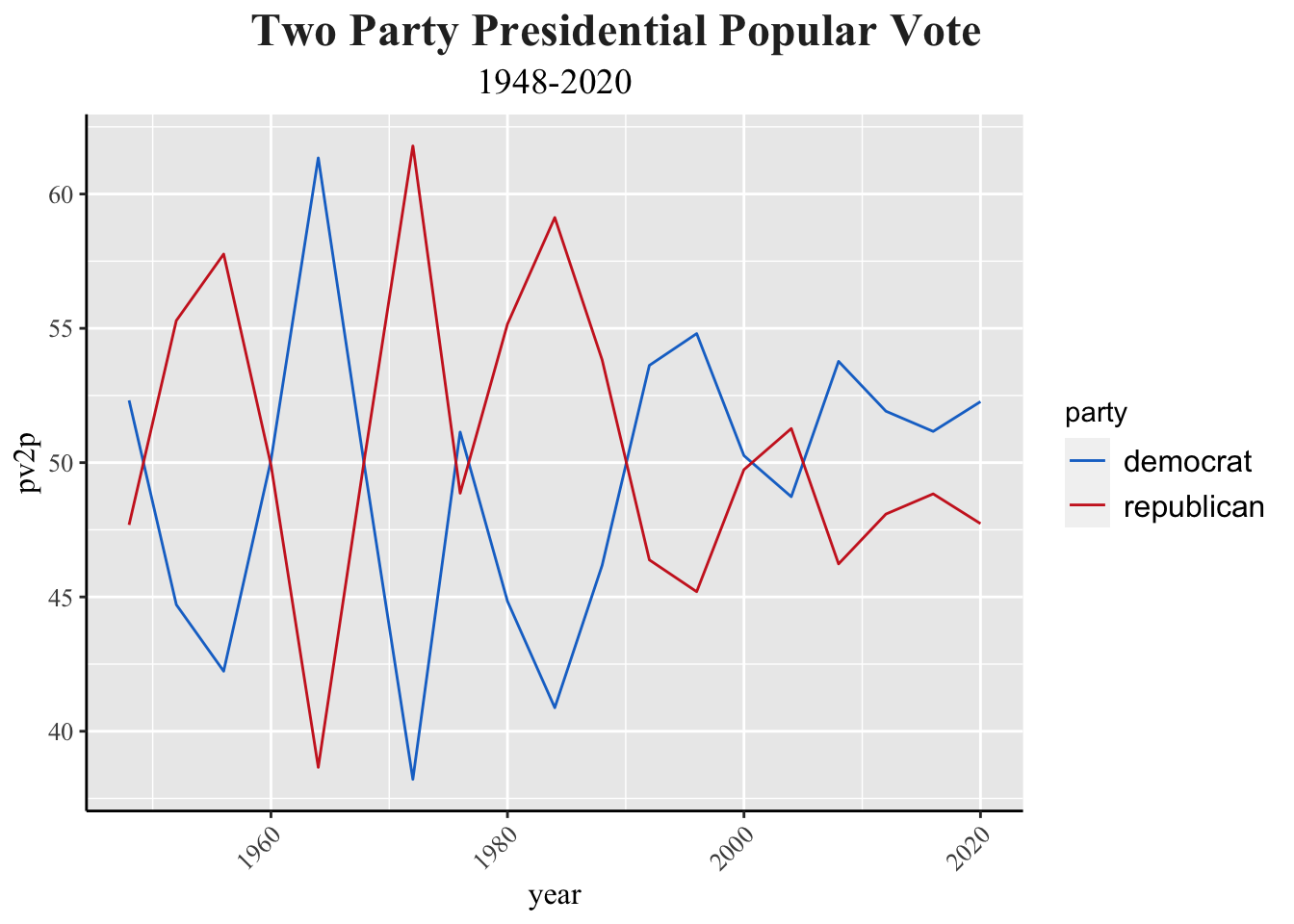
Some notable trends exist over the past century, many of which can be credited to significant historical events. It’s clear that the difference between the two party’s vote share was much more drastic decades ago. Today, elections are likely to be within a ten point margin, whereas in the late 20th century, they would exceed 20 point differences. In recent decades, elections have become tighter, reflecting increased polarization and more closely divided public opinions on key issues. This tightening is often attributed to growing ideological divisions between the parties and heightened partisan engagement among voters.
####----------------------------------------------------------#
#### State-by-state map of presidential popular votes.
####----------------------------------------------------------#

# Sequester shapefile of states from `maps` library.
states_map <- map_data("state")

# Read wide version of dataset that can be used to compare candidate votes with one another.
d_pvstate_wide <- read_csv("~/Downloads/clean_wide_state_2pv_1948_2020.csv")
## Rows: 959 Columns: 14
## ── Column specification ────────────────────────────────────────────────────────
## Delimiter: ","
## chr  (1): state
## dbl (13): year, D_pv, R_pv, D_pv2p, R_pv2p, D_pv_lag1, R_pv_lag1, D_pv2p_lag...
##
## ℹ Use `spec()` to retrieve the full column specification for this data.
## ℹ Specify the column types or set `show_col_types = FALSE` to quiet this message.
# Merge d_pvstate_wide with state_map.
d_pvstate_wide$region <- tolower(d_pvstate_wide$state)
pv_map <- d_pvstate_wide |>
filter(year == 2020) |>
left_join(states_map, state_abb, by = "region")
# Make map grid of state winners for each election year available in the dataset.
pv_win_map <- d_pvstate_wide |>
filter(year == 2020) |>
left_join(states_map, by = "region") |>
mutate(winner = if_else(R_pv > D_pv, "republican", "democrat"))
pv_win_map |>
ggplot(aes(long, lat, group = group)) +
geom_polygon(aes(fill = winner), color = "black") +
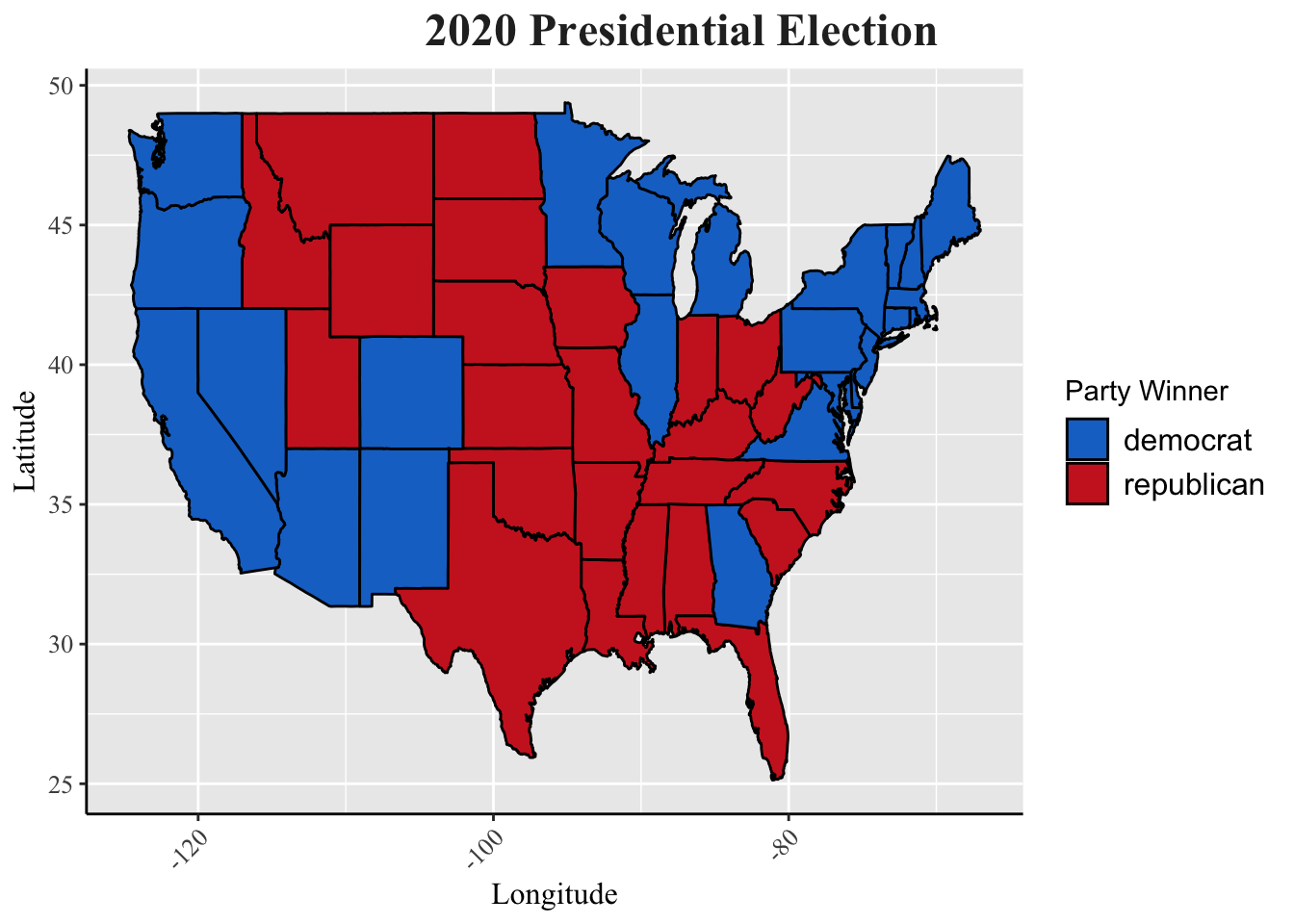
labs(title = "2020 Presidential Election",
y = "Latitude", x = "Longitude") +
scale_fill_manual(values = c("dodgerblue3", "firebrick3"),
name = "Party Winner") +
my_blog_theme()
d_pvstate_wide |>
filter(year >= 1980) |>
left_join(states_map, by = "region") |>
mutate(winner = ifelse(R_pv> D_pv, "republican", "democrat")) |>
ggplot(aes(long, lat, group = group)) +
facet_wrap(facets = year~.) +
geom_polygon(aes(fill=winner), color = "white") +
scale_fill_manual(values = c("dodgerblue3", "firebrick3")) +
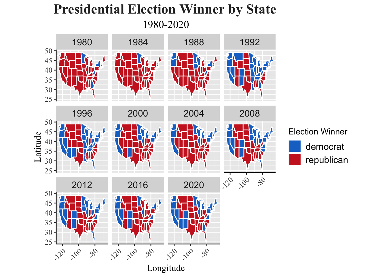
labs(title = "Presidential Election Winner by State",
subtitle = "1980-2020",
y = "Latitude", x = "Longitude") +
guides(fill=guide_legend(title = "Election Winner")) +
theme(strip.text = element_text(size = 12),
aspect.ratio=1) +
my_blog_theme()
## Warning in left_join(filter(d_pvstate_wide, year >= 1980), states_map, by = "region"): Detected an unexpected many-to-many relationship between `x` and `y`.
## ℹ Row 1 of `x` matches multiple rows in `y`.
## ℹ Row 1 of `y` matches multiple rows in `x`.
## ℹ If a many-to-many relationship is expected, set `relationship =
##   "many-to-many"` to silence this warning.
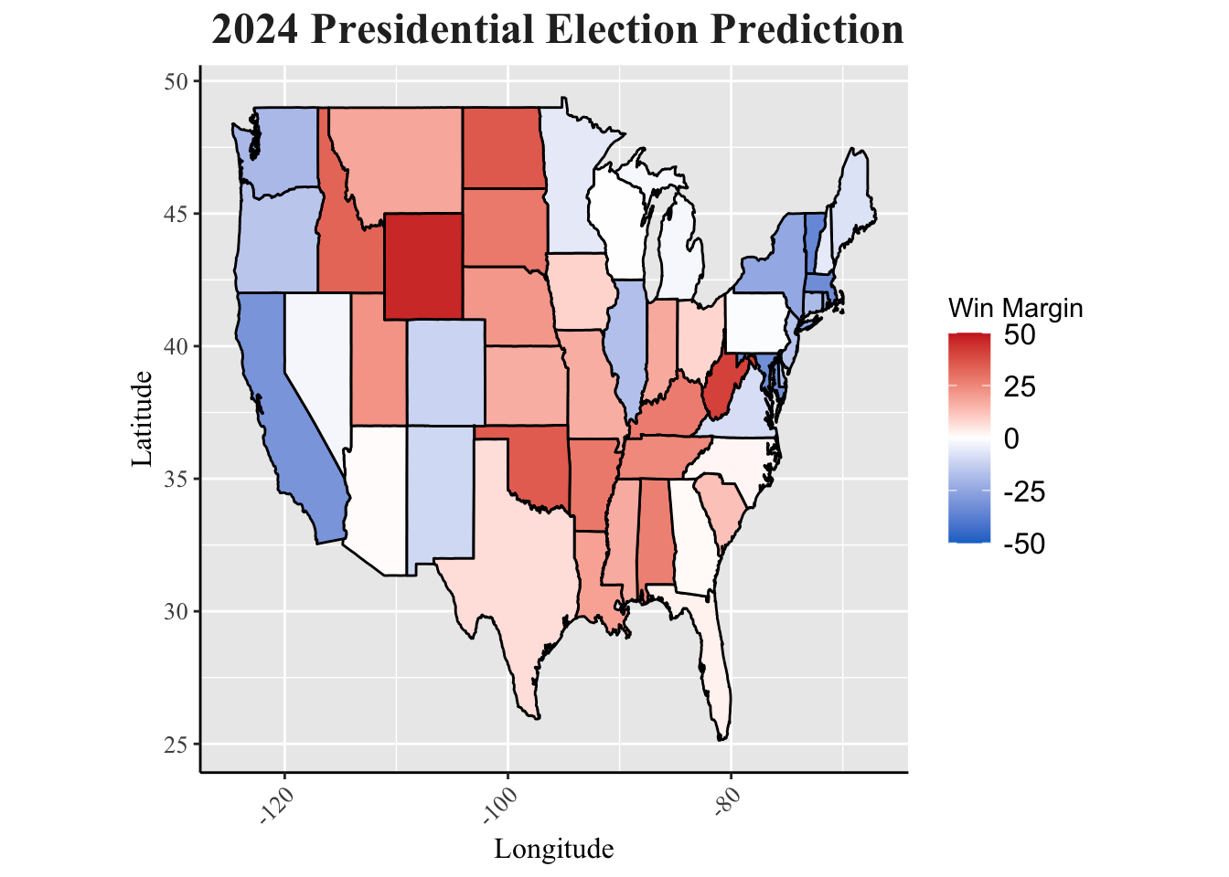
Using the simplified electoral cycle model (vote_2024 = 3/4vote_2020 + 1/4vote_2016), we can predict the two party popular vote share for the 2024 election. The map below details the vote share by state, coloring states blue that voted Democratic and states red that swing Republican. However, it is important to note that our elections do not rely on the popular vote outcome. Oftentimes, states vote a consistent way that make elections somewhat predictable. This causes elections to generally rely on the votes of a handful of swing states who bounce between blue and red. Usually, the popular votes can match the outcome of the election, but since we have an electoral college, this is not always the case. Namely, the 2016 election caused uproar when Hillary Clinton defeated Donald Trump in the popular vote, but lost the electoral college. In history, this has happened five times. That’s why it’s crucial that election predictions go one step further and look at the electoral college votes.
####----------------------------------------------------------#
#### Prediction Based on Popular Vote
####----------------------------------------------------------#

pv2p_2024_states |>
  left_join(states_map, by = "region") |>
  ggplot(aes(long, lat, group = group)) +
  geom_polygon(aes(fill = pv2p_2024_margin), color = "black") +
  scale_fill_gradient2(high = "firebrick3",
                       mid= "white",
                       name = "Win Margin",
                       low = "dodgerblue3",
                       breaks = c (-50, -25, 0, 25, 50),
                       limits = c(-50, 50)) +
  theme(strip.text = element_text(size = 12),
        aspect.ratio=1) +
  labs(title = "2024 Presidential Election Prediction",
       y = "Latitude", x = "Longitude") +
  my_blog_theme()
####----------------------------------------------------------#
#### Prediction Based on Popular Vote
####----------------------------------------------------------#

# Generate projected state winners and merge with electoral college votes to make summary of electoral college vote distributions.

ec_full <- read_csv("~/Downloads/ec_full.csv")
## Rows: 936 Columns: 3
## ── Column specification ────────────────────────────────────────────────────────
## Delimiter: ","
## chr (1): state
## dbl (2): electors, year
##
## ℹ Use `spec()` to retrieve the full column specification for this data.
## ℹ Specify the column types or set `show_col_types = FALSE` to quiet this message.
pv2p_2024_states <- pv2p_2024_states |>
  mutate(winner = ifelse(R_pv2p_2024 > D_pv2p_2024, "R", "D"),
         year = 2024)

pv2p_2024_states <- pv2p_2024_states |>
  left_join(ec_full, by = c("state", "year"))

pv2p_2024_states |>
  group_by(winner) |>
  summarise(electoral_votes = sum(electors))
## # A tibble: 2 × 2
##   winner electoral_votes
##   <chr>            <dbl>
## 1 D                  276
## 2 R                  262
I removed 1948 from the data set because there is only 19% of popular vote accounted for in Alabama, which is not historically accurate. Also, the electoral college data set does not have an elector count recorded for 1948. 1960 is also not included in the electoral college data set, so the election results are not represented.
# Joining electoral college vote data with d_ec_wide datas et

d_ec_wide <- d_ec_wide |>
  left_join(ec_DC, by = c("state","year"))

# Finding the winner of each election

d_ec_wide <- d_ec_wide |>
  group_by(year, state_winner)|>
  summarize(electoral_votes = sum(electors))
## `summarise()` has grouped output by 'year'. You can override using the
## `.groups` argument.
ec_winners <- d_ec_wide |>
  pivot_wider(names_from = state_winner, values_from = electoral_votes) |>
  mutate(election_winner = ifelse(D >= 270, "D", "R"))
####----------------------------------------------------------#
#### Extension 3: Mapping Swing States Over Time
####----------------------------------------------------------#

d_pvstate_wide_more <-  d_pvstate_wide |>
  filter(year >= 1976) |>
  mutate(swing = (D_pv2p / (D_pv2p + R_pv2p)) - (D_pv2p_lag1 / (D_pv2p_lag1 + R_pv2p_lag1))) |>
  mutate(region = tolower(state))

d_pvstate_wide_more |>
  filter(year >= 1980) |>
  left_join(states_map, by = "region") |>
  ggplot(aes(long, lat, group = group)) +
  facet_wrap(facets = year ~.) +
  geom_polygon(aes(fill = swing), color = "white") +
  scale_fill_gradient2(low = "firebrick3",
                      high = "dodgerblue3",
                      mid = "white",
                      name = "Voter Swing",
                      breaks = c(-0.2, -0.15, -0.1, 0, 0.1, 0.15, 0.2),
                      limits = c(-0.2, 0.2)) +
  labs(title = "Presidential Election Voter Swing") +
  my_blog_theme()
## Warning in left_join(filter(d_pvstate_wide_more, year >= 1980), states_map, : Detected an unexpected many-to-many relationship between `x` and `y`.
## ℹ Row 1 of `x` matches multiple rows in `y`.
## ℹ Row 1 of `y` matches multiple rows in `x`.
## ℹ If a many-to-many relationship is expected, set `relationship =
##   "many-to-many"` to silence this warning.
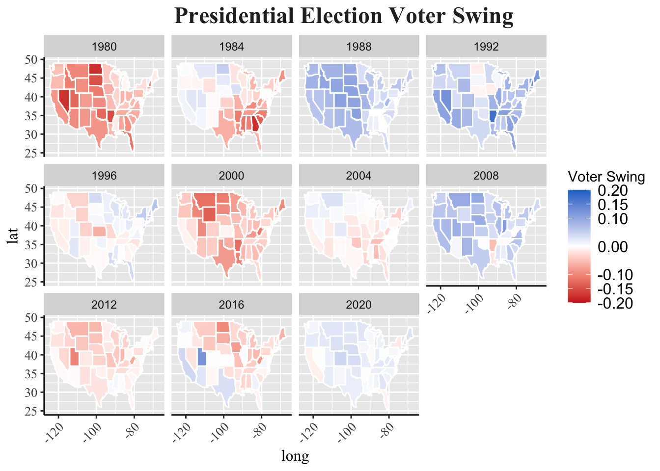 Oftentimes, presidential candidates will focus their campaigning on a handful of states, including Arizona, Georgia, Michigan, Pennsylvania, and more. The map grid displayed showcases why this is the case. States shaded a darker color had greater shift in how individuals voted. This is important because candidates will focus their attention, knowing that voters are persuadable year to year.